PRODUCT DESIGN · 2026
Swipey Admin
Proven on desktop. Unusable in a pocket.
ROLE
Design and design QA on the first admin-facing mobile release, built with AI agents and prototyped for stakeholders and a wide ranged audience age.
THE GAP
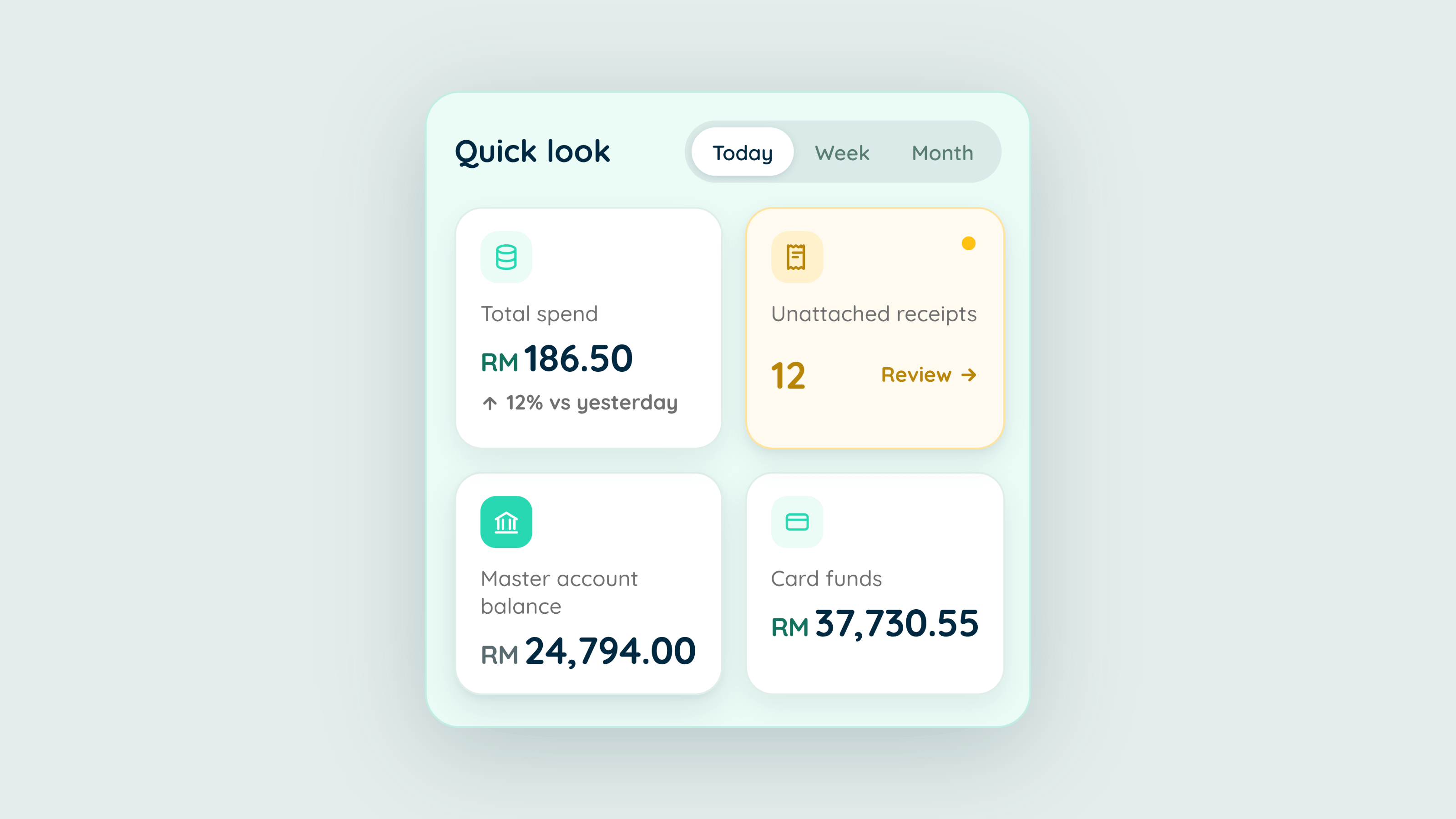
Every admin flow already worked on desktop: deposit, top up, clawback, issue card, invite, approve. None of it was reachable from a phone. The people who needed it were away from their desks.
The desktop product was the research. Every rule, status and edge case already had a proven answer, so the job was translation, not invention.
THE DECISION
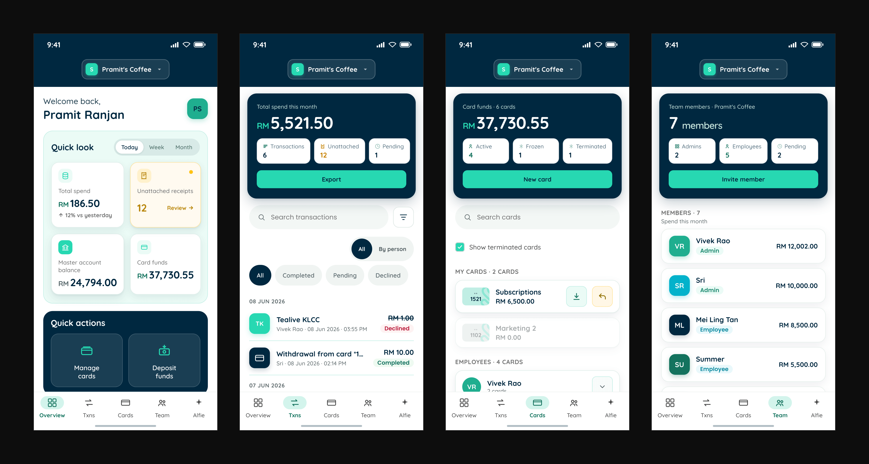
Port the business rules, don't reinvent them. Writing new validation for flows that already worked would have been risk with extra steps.
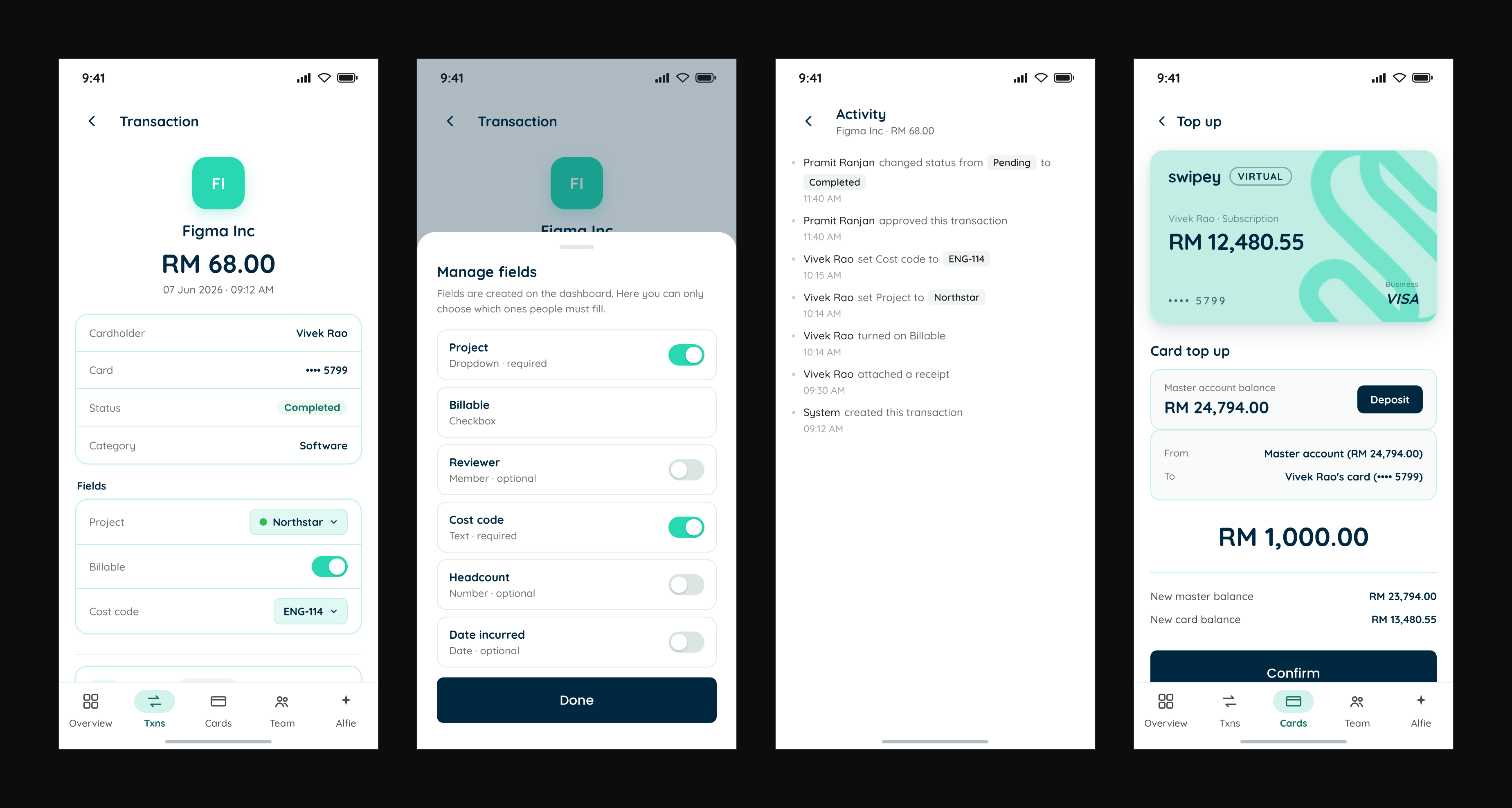
I reviewed it screen by screen, giving every finding a stable ID and a severity tier, and tagging the ones engineering had to build as requirements rather than visual edits.
WHAT SHIPPED
Every admin flow on a phone, with a legibility floor, 44px targets, an AA contrast system, and one status vocabulary instead of two.
WHAT STUCK