UX DESIGN · 2026
Franklin's
The experience starts before you walk in.
ROLE
Team lead on a five-person UXDG 101 project. I ran the research, the fieldwork, the card sort, the IA, and the final Figma prototype.
THE GAP
Franklin's is great once you're inside. The job was to close the gap between the website and what people actually walked into.
FOLLOWING THE FIRST VISIT
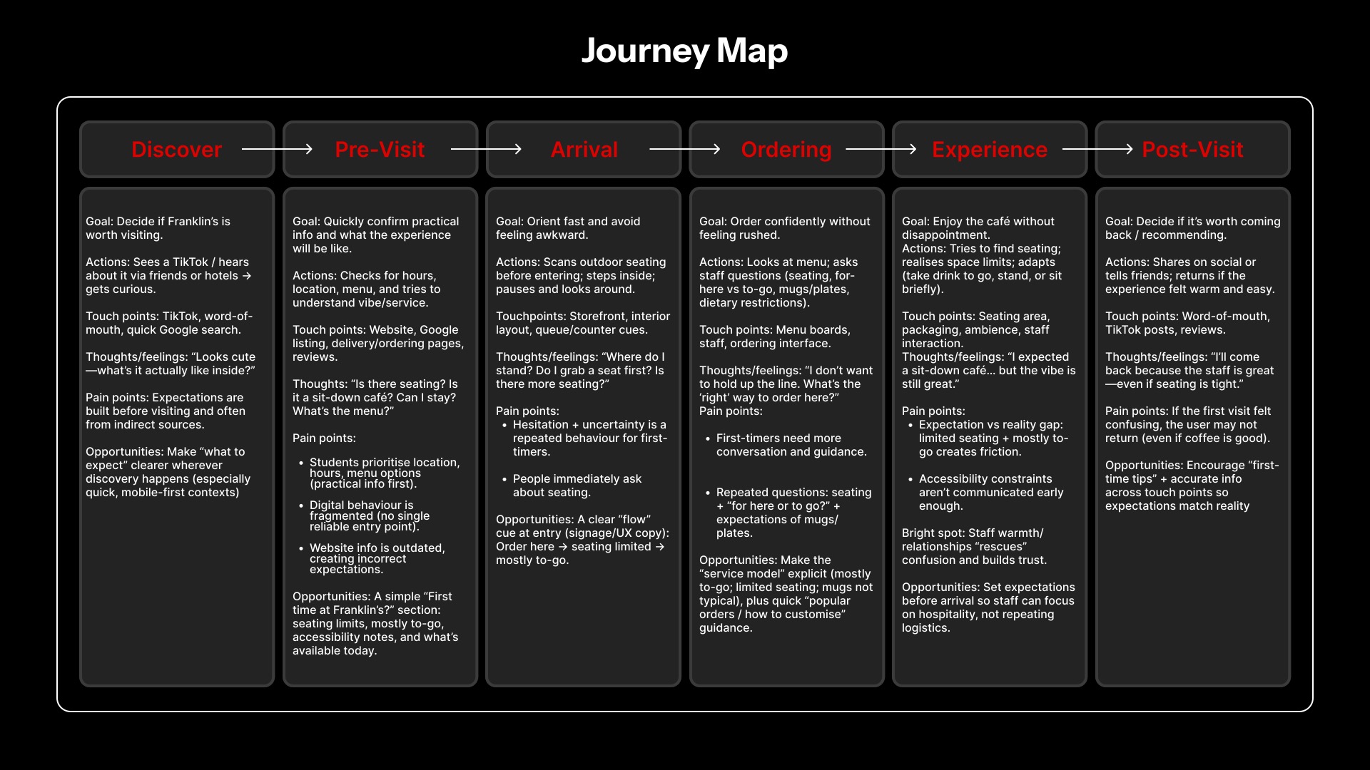
Interviews with baristas and customers, plus a SCAD student survey. The site was outdated, the service model unclear, and none of the in-person warmth made it online.
What people needed before walking in
The warmth was there in person. Online, people first needed clear answers to four practical questions.
- What can I order?
- Is there seating?
- How does service work?
- When are you open?
THE DECISION
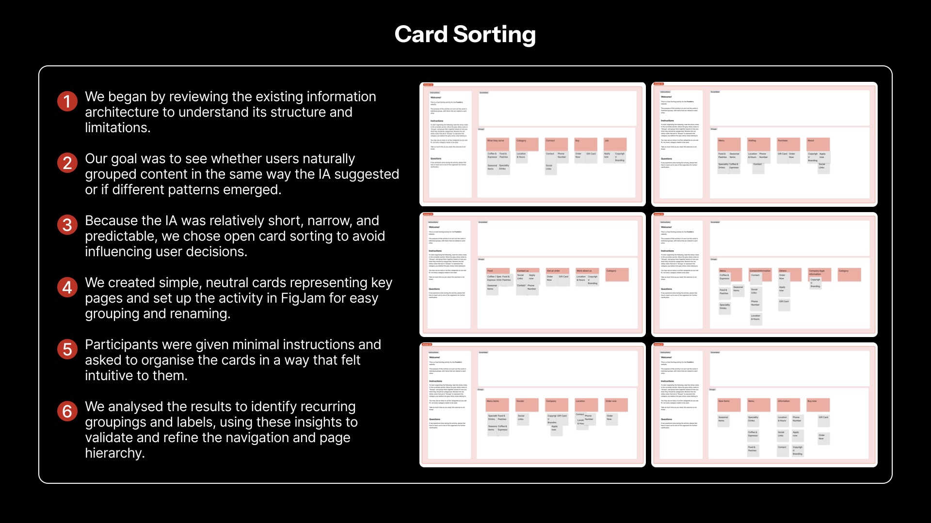
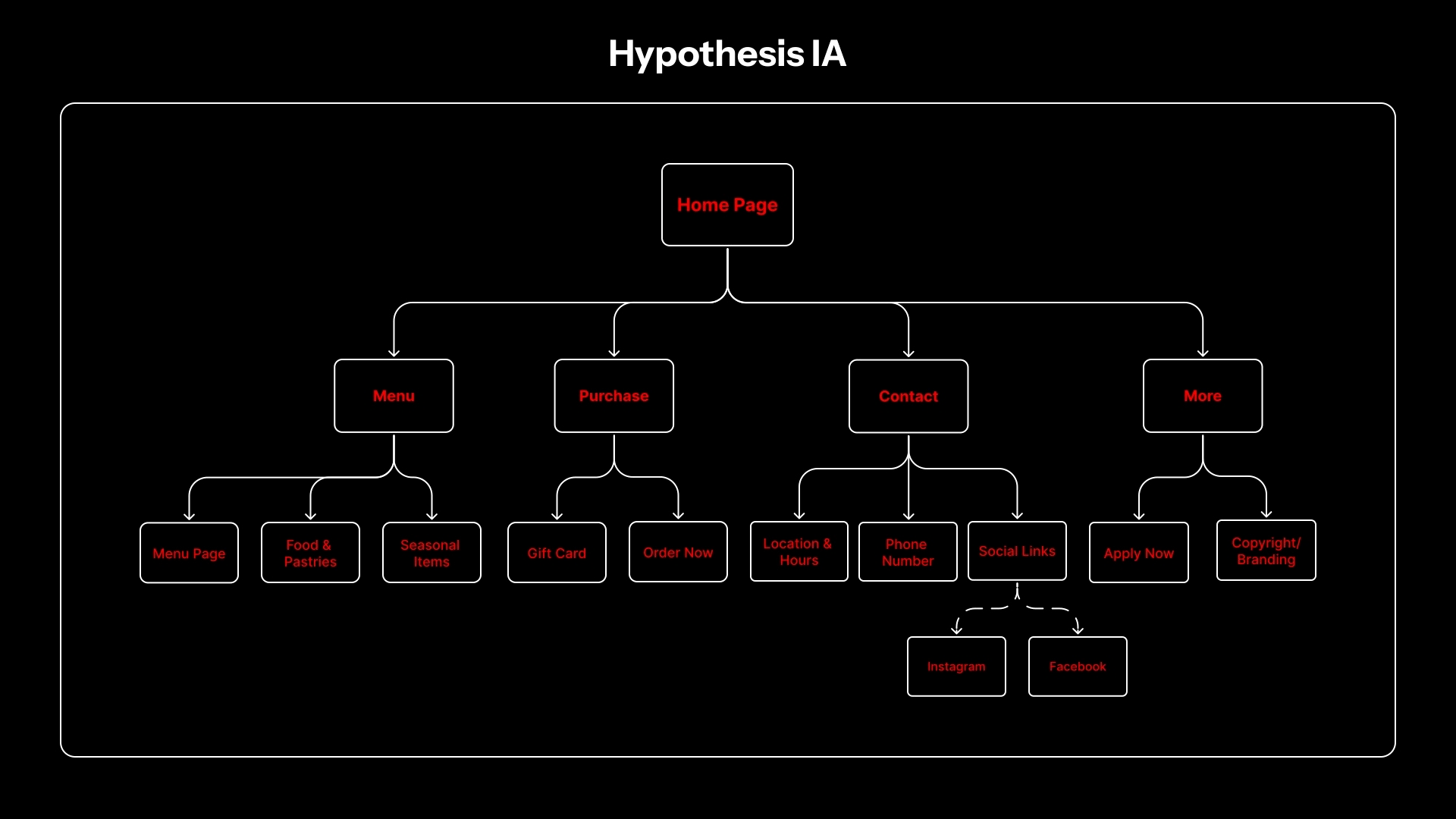
People don't think in business categories, they think in tasks. A card sort surfaced four groups — Menu, Order, About, Contact — and that became the nav.
Task first. Category second.
The open card sort moved the site from an internal sitemap to four things visitors could actually look for.
- Menu
- Order
- About
- Contact
MAKING THE FIRST VISIT CLEAR
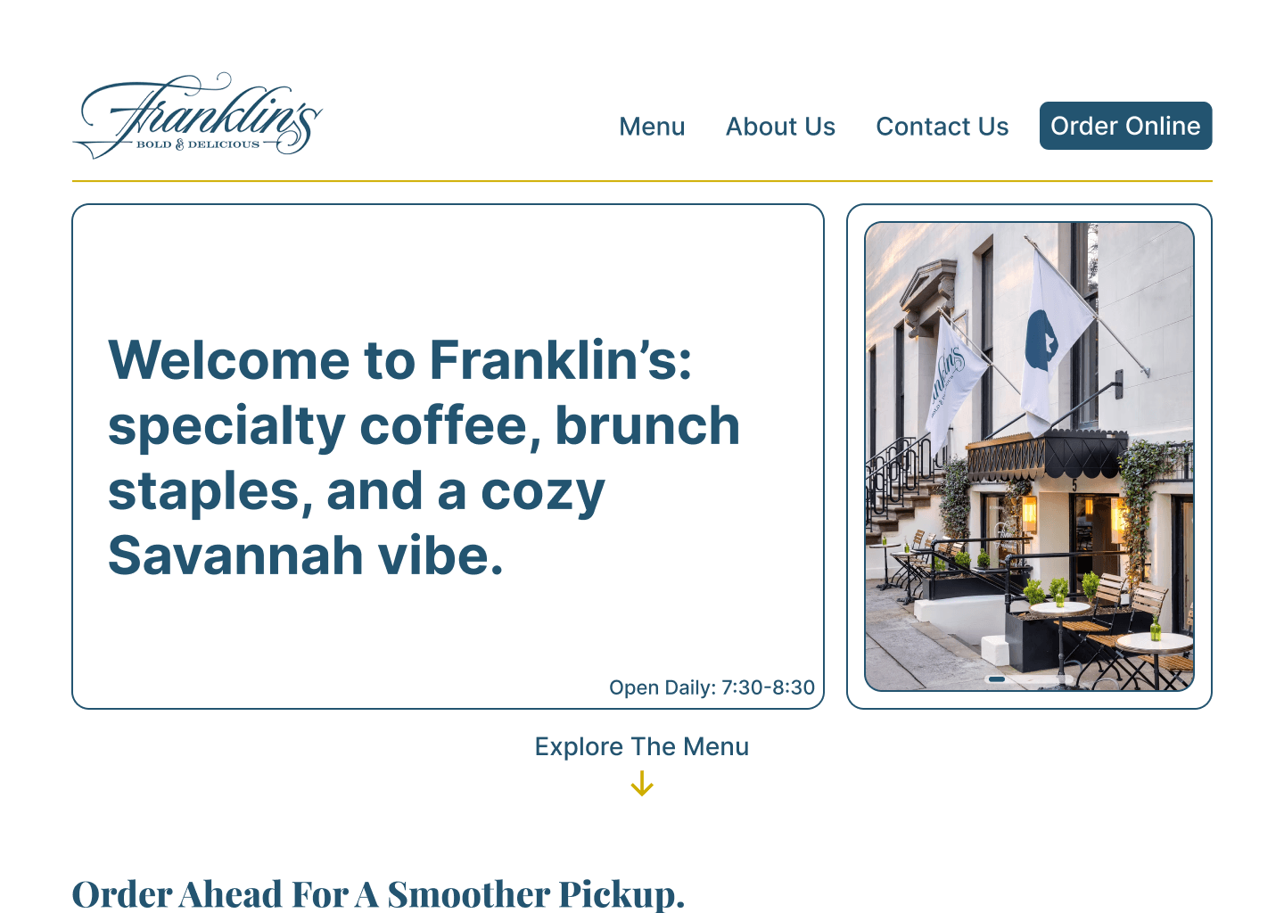
I rebuilt the homepage around the practical questions first: seating, service style, hours. Navigation dropped to four items, and a full test order ran start to finish without anyone hitting a wall.
THE REDESIGN
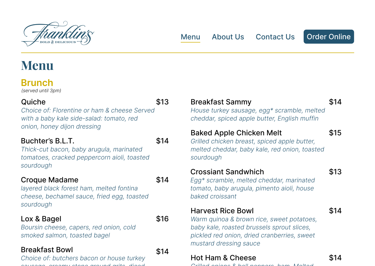
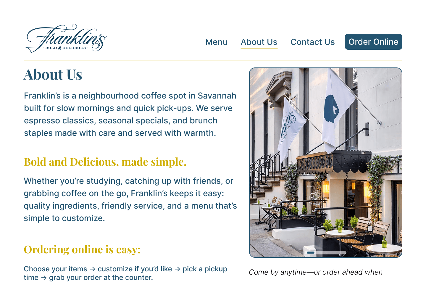
Task-based navigation, a rebuilt homepage, a cleaner menu, and an order flow you can actually follow.
WHAT STUCK