SOHO
A sixth form art exhibition as diverse as the districts it's named after.
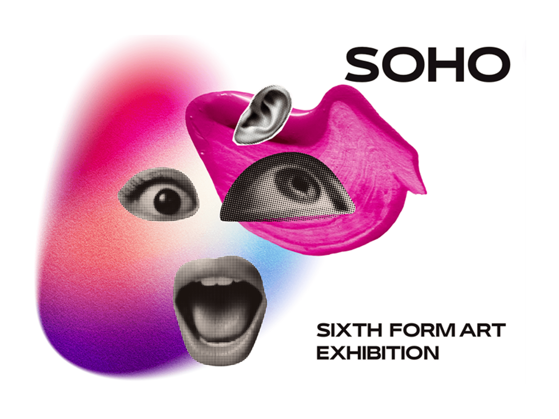
SOHO was the 2024 Sixth Form Art Exhibition, planned and run by students. Named after the SOHO districts of London and New York, it pulled art, fashion and music under one identity.
Chair of the exhibition: organising, delegating, managing tasks, and leading all branding.
I treated SOHO as a cultural zone, many creative voices under one name. That became the anchor: every artist is different, but the exhibition holds them together.
Each artist is different. The exhibition holds them together.
KEY INSIGHT_
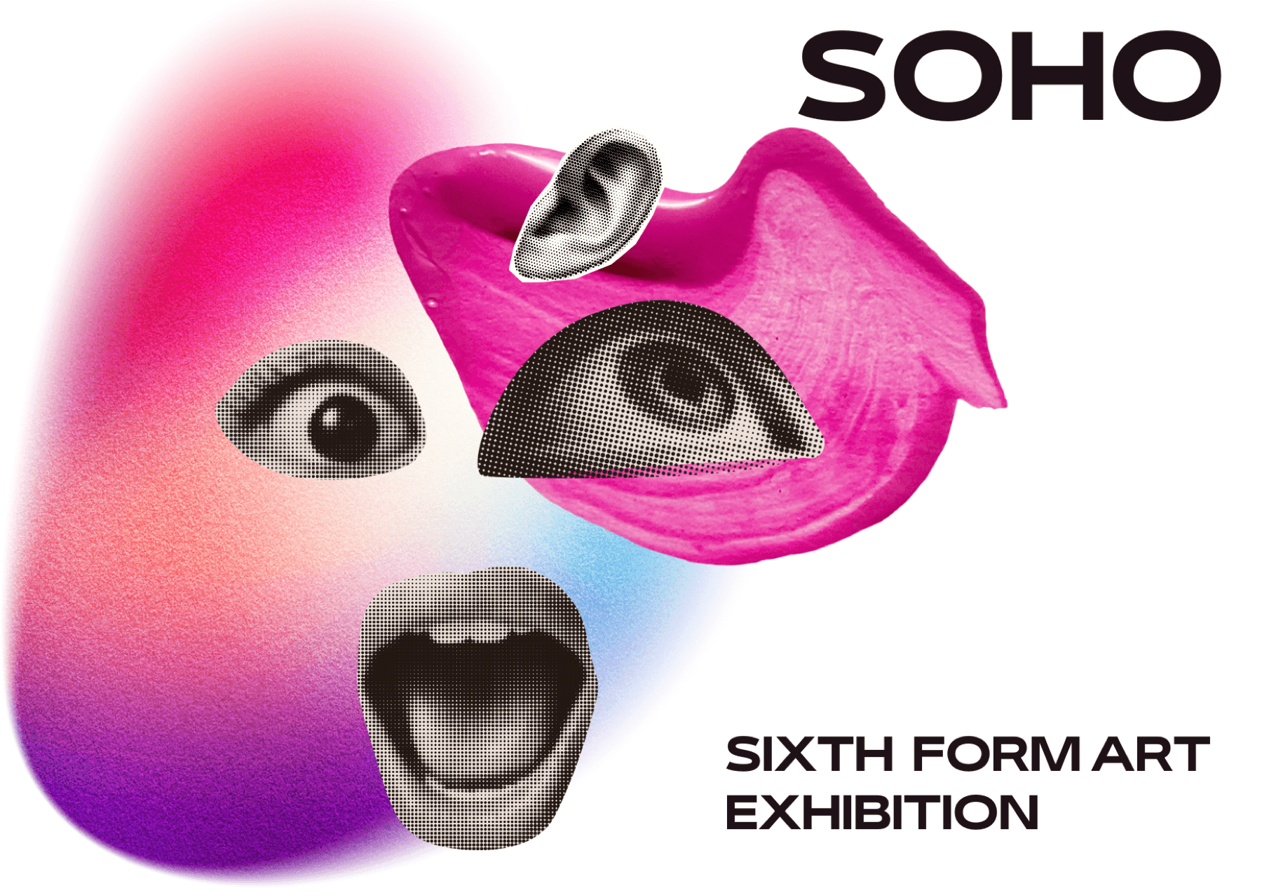
The problem was representing sensory diversity visually. Fragmented sensory imagery, eyes, mouths and ears, combined with gradient blobs to carry the plurality.
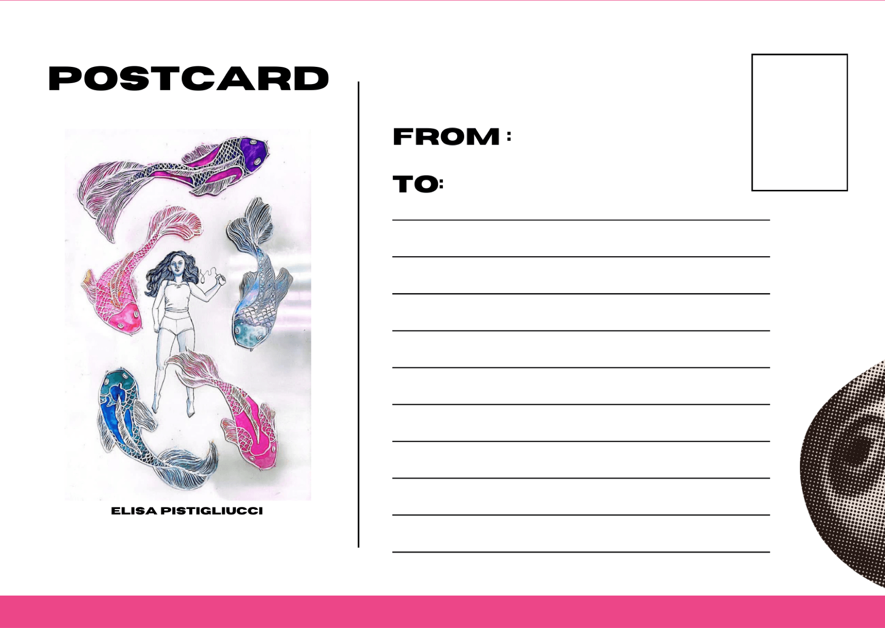
A bold typographic lockup against sensory collage kept the branding layered and alive rather than institutional, with the poster, email banner and postcards designed as one system.
A full exhibition identity: A3 poster, email banner, and a postcard series featuring each participating artist's work, sold for charity.
Chairing it taught me design leadership is as much coordination as craft. Getting peers to hit deadlines was harder than the visual work. Next time I'd set a production timeline from day one.